TooSharp Engineering

TooSharp Website

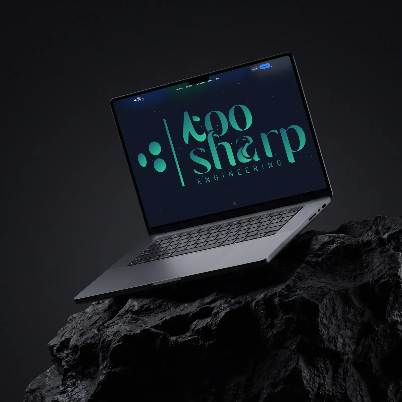
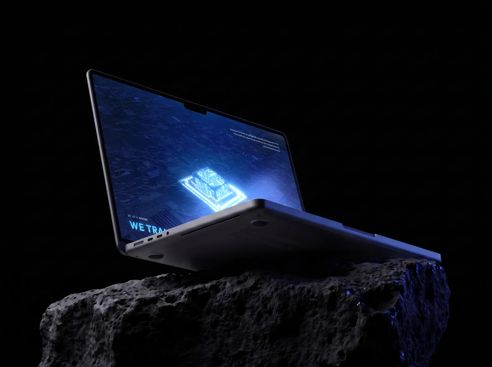
A fast-growing technology firm needed a site that says what it does. Its promise comes in three beats: build what doesn't exist, transform what's behind, optimize what's inefficient. So the site opens by playing it: a 3D sequence you scrub with the scroll, a chip waking on a circuit board as each beat lands. Behind it, the whole offer sits two menus deep, and the 3D is tuned to stay smooth on a phone. I designed the UI/UX and made the 3D sequence; a developer built the front end with me.

Industry
Engineering and technology
Type
Website
Role
UI/UX design, 3D motion

01

Desktop and mobile

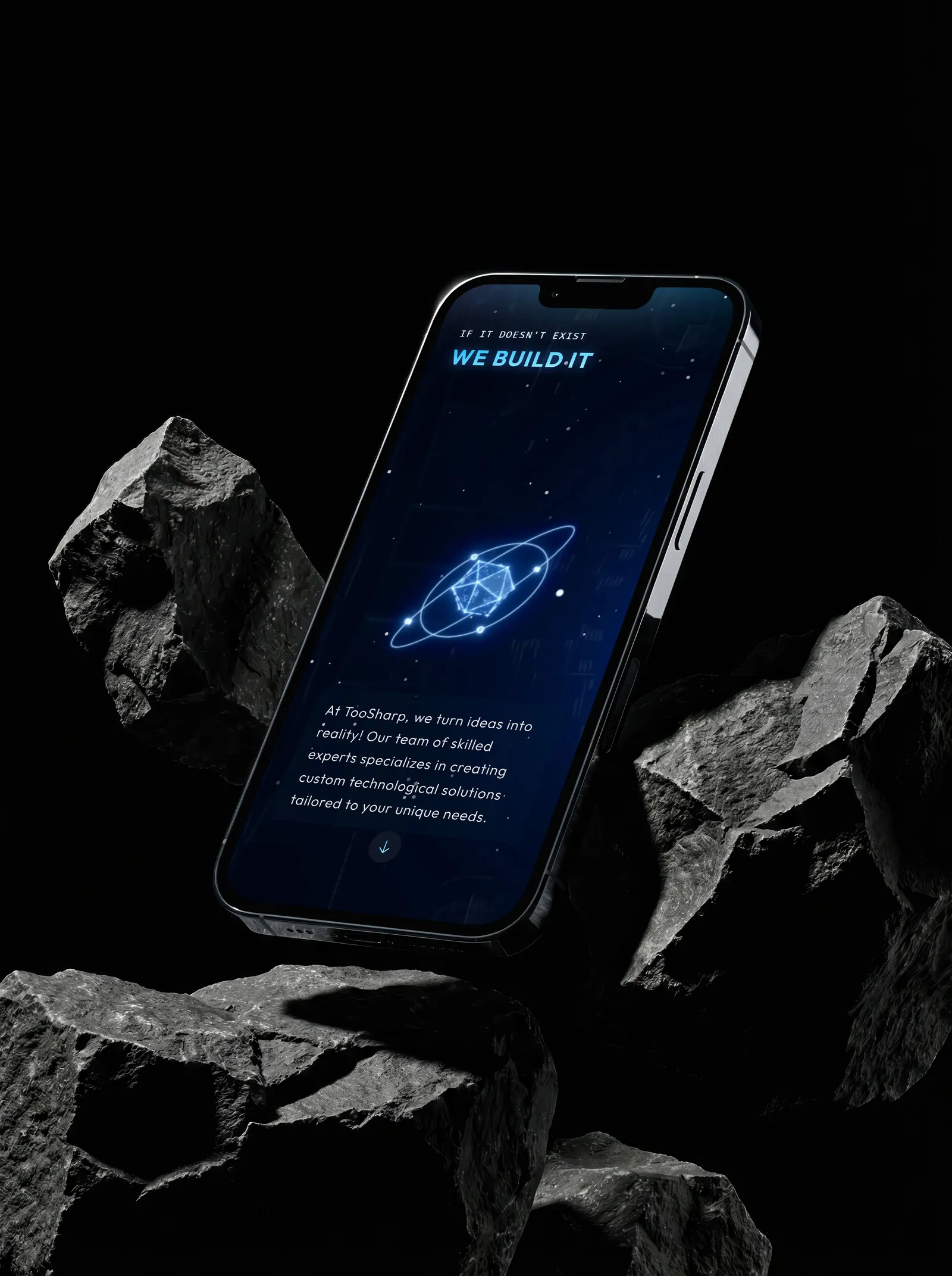
A scroll story composed for a wide screen breaks on a phone. So one design system runs from desktop down, and on mobile the opening gets its own frame set: the line above the 3D, the story below it.

Desktop and mobile, image 1
Desktop and mobile, image 2
Desktop and mobile, image 3
Desktop and mobile, image 4

02

Scroll as a timeline

A video plays at its own pace; a scroll plays at the reader's. So the opening is 3D you scrub: an icosahedron turns in orbit, a chip wakes on a circuit board, light races out across it, and the TooSharp mark resolves on the chip. The firm's line lands over it in three beats: if it doesn't exist, we build it; if it's behind, we transform it; if it's inefficient, we optimize it.

03

Navigation

A broad offer is easy to get lost in. Two mega menus carry all of it. Solutions sorts it by the environment it serves: command and control, AV and digital environments, critical infrastructure. Portfolio sorts the work by sector, from corporate and government to museums and healthcare, and by how the firm was engaged: design and build, design only, or build only.

04

Spaces & Systems

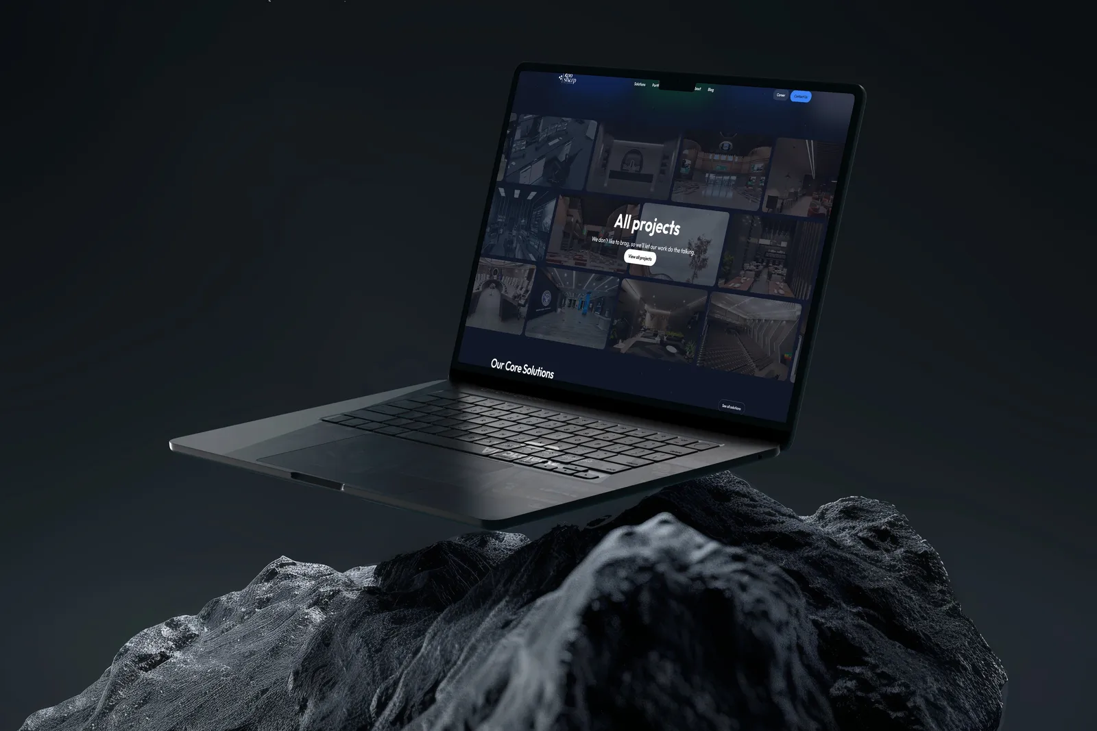
A portfolio this broad needs a way in. Named after the firm's line, it searches and filters by category, type, sector and tag, and each project opens in a panel with its sector, its type and the technologies behind it, one click from the full case study.

05

Case studies

Readers look for their own field first. So case studies sit in sliding rows by field, from digital transformation and infrastructure to convention and meeting spaces, and each opens on its story, the key upgrades and the project details, with a gallery that opens full screen.

06

About

Trust comes before the brief. About carries the firm's story and numbers, its guiding principles, what clients say, and the technology partners and clients behind the work, with a section menu that follows the reader down the page.

07

Blog

A site stays alive by what it adds. Insights opens on a featured article, then the rest, with search, categories and sorting.

Visit site

Closing thoughts

A firm that builds technology should feel like one from the first scroll. What I took from it: on the web, fidelity is worth only what the slowest phone can play.

Services
UI/UX design3D motion design
Tools
Cinema 4DAfter EffectsGSAP ScrollTrigger
Date
2025
Collaborators
A front-end developer, who built the site from my designs